


Purnian: Oats and Muesli Packaging Design for a High-Protein Breakfast Brand
An F&B brand focused on creating healthier breakfast options for modern health conscious consumers.

ABOUT THE PROJECT
The breakfast aisle is one of the most competitive spaces in food retail. From oats and granola to cereals and muesli, consumers are presented with countless choices that often look and feel similar.
Purnian was launching a range of oats and muesli products aimed at health-conscious consumers looking for convenient and nutritious breakfast options. The range included multiple flavours and pack sizes, requiring a packaging design system that could remain consistent while allowing each SKU to have its own identity.
The goal was simple: create packaging that stood out instantly while reinforcing the brand's modern, health-focused positioning.
PROJECT TYPE
Packaging Design
YEAR
2026
TIMELINE
<4 weeks


OUR SOLUTION
One of the biggest challenges in oats packaging design and muesli packaging design is shelf visibility. Most brands rely on ingredient imagery, nutritional claims, and crowded layouts, often making products look interchangeable.
We wanted Purnian to be recognised instantly.
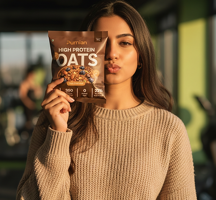
Instead of treating the product name as secondary information, we turned it into the hero of the packaging. Large-scale typography featuring the words Oats and Muesli became a key design element, creating immediate recognition across the entire range.
You can read and recognise the product from a distance. Paired with a scrumptious visual of the product it helps the customer understand the product in a second.
A combination of warm brown tones and vibrant flavour-led colours helped distinguish individual variants while maintaining consistency across the range. Strawberry and chocolate flavours each received their own visual cues, making navigation easier for consumers while preserving a unified brand identity.


THE RESULTED IMPACT
As a growing FMCG brand, Purnian needed more than a single package design. The system had to support future product launches while maintaining a cohesive look across the range.
The typography-first approach allowed the packaging to scale efficiently across multiple formats, flavours, and product categories. This flexibility ensures that future products can be added without diluting the overall brand identity.
By combining bold typography with a flexible packaging system, the brand was able to create a range that feels contemporary, organised, and easy to recognise across different formats and flavours. The design balances appetite appeal with a clean, modern aesthetic, helping the products stand out in both domestic and export markets.
The result was a packaging system designed to scale across multiple SKUs while remaining clear, modern, and highly visible on shelf.
Here is what the client had to say on google:
"I recently worked with Dishi and her team, and they delivered amazing work. I absolutely loved all my designs—I couldn’t ask for anything better.
They’re prompt and always just a call or message away. Special thanks to Shaukeen!Thank you Dishi for everything 😊"
-Pritu R.

.png)
Suramya's Impact On Purnian
Packaging design for a new breakfast range aimed at health-conscious consumers.
Before Suramya
ⓧ No packaging available
ⓧ Limited scalability
ⓧ Unclear understanding on differentiating products
With Suramya
✓ Easily recognised & remembered by ICP
✓ Easily scalable for new SKUs
✓ Easily understood on shelf


