


Blue Tokai Brand Strategy Breakdown: How Packaging Built India's Biggest Specialty Coffee Brand

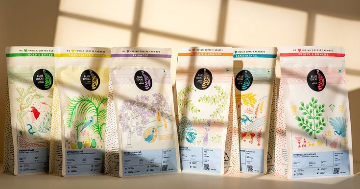
Blue Tokai built India's largest specialty coffee brand not by imitating Starbucks, but by doing the opposite, rooting its packaging, name, and identity entirely in Indian culture and verified origin. Founded in 2013 by Matt Chitharanjan, Namrata Asthana, and Shivam Shahi, starting as two people hand-labelling bags in a Gurugram bedroom, the brand grew into a business reporting ₹332.7 crore in FY25 revenue, up 50.5% from ₹221.1 crore the year before, according to Inc42's datalabs. The brand's entire visual system is built around real farm stories told through traditional Indian art, Gond, Warli, and Madhubani, rather than a generic global café aesthetic. The lesson for founders: real, specific origin, told consistently through packaging, is harder to copy than any amount of polish.
From a Bedroom to a ₹332 Crore Business
Every big brand story sounds inevitable in hindsight. Blue Tokai's genuinely wasn't. It started in 2013 with two founders, later joined by a third, hand-roasting coffee and labelling bags themselves in a Gurugram bedroom, no café, no funding round, no visual identity system yet, just a product good enough that people started saying they'd never tasted coffee like it in India before.
That's the part worth sitting with before getting to the clever branding decisions: Blue Tokai earned the right to build a brand story because the product delivered first. The branding didn't manufacture the demand, it gave a real, already-forming demand a way to recognise and talk about itself.
From there, growth compounded, and one specific decision stands out as genuinely counterintuitive. When the pandemic hit in 2020, cafés shut overnight and revenues plunged across the industry. Most brands retreated. Blue Tokai did the opposite, opening 15 to 16 new outlets during that exact window, a calculated bet to secure prime real estate at sharply lower rents while competitors were pulling back. That decision, made under real uncertainty, directly fed the growth that followed: revenue climbed from ₹41 crore in FY21 to ₹240 crore within three years, and to ₹332.7 crore by FY25, per Inc42's reporting.

The funding trajectory tells a similar story of confidence building over time. Blue Tokai raised a $35 million Series C in August 2024, led by Belgian investment firm Verlinvest, valuing the company at roughly ₹1,500 crore at the time. A further $24.95 million Bridge-II round followed in September 2025. Total funding raised sits somewhere between $92 million and $103 million depending on the data source, Inc42 and CBInsights track this slightly differently, but either figure reflects a business investors have backed repeatedly over more than a decade, not a single lucky round.
The Name Itself Is a Brand Strategy Decision

Here's something most fragrance, food, and coffee founders skip entirely: Blue Tokai's own name carries the brand's positioning inside it. "Tokai" is an old Malabari word for a peacock's tail, a direct reference to South Indian coffee estates where peacocks genuinely walk through the plantations. It's not a decorative flourish, it's literally describing where the coffee comes from.
This is the opposite of what most category entrants do. A huge number of Indian D2C brands reach for names that sound vaguely international or aspirational, with no real connection to what the product is or where it's from. Blue Tokai went the other direction, and that decision shows up again immediately in the logo, a bright blue peacock motif enclosed in a circle, rendered across blue, black, and white variations depending on application. On packaging, that large peacock mark creates strong, repeated recall precisely because it isn't just a pretty icon, it's tied directly to the plantation story the whole brand is built on.
Packaging as the Actual Brand Story, Not Just a Container
This is the part of Blue Tokai's strategy most directly relevant to anyone building a packaged consumer brand in India. Instead of a generic "specialty coffee" template, the packaging features real traditional Indian art forms: Gond art from central India's Gond tribe, intricate patterns rooted in folk tales and nature; Warli art from Maharashtra, geometric figures depicting daily rural life and harvests; and Madhubani art, whose peacock imagery ties directly back to the brand name.

Crucially, this isn't decoration borrowed for visual flair. Each piece was commissioned to tell the story of a specific coffee farm. One widely referenced example: Gond artist Sukhnandi Vyam created a piece titled "The Coffee Tree," depicting human life intermingled with forest animals surrounding coffee shrubs, a direct visual translation of what the actual estate the coffee comes from looks like. Beyond the primary packaging, the same visual language extends into the physical café experience itself, matching decor and even branded service ware carried consistently across the chain's 115+ outlets, so the story doesn't stop at the bag, it continues into the space.
This is the genuinely hard-to-copy part of the strategy. A competitor can copy a colour palette or a minimalist layout in a weekend. A competitor cannot copy a real, specific relationship with a specific farming community and a commissioned art piece that tells that farm's actual story. It works because it's grounded in something true, the coffee genuinely does come from the South Indian estates the packaging depicts, not because the art style itself is inherently unique.
Three Coffee Brands, Three Completely Different Strategies
Blue Tokai's approach becomes even clearer when set against two other Indian specialty coffee brands that launched around the same era and chose to compete on entirely different terms.
Third Wave Coffee, founded in Bangalore in 2016 and backed by $35 million in funding as of late 2023, chose community and physical space as its core differentiator. Its positioning statement, developed through a 2021 brand refresh built around commissioned artwork from Indian artists across its café spaces, centres explicitly on "building communities over coffee." Like Blue Tokai, Third Wave invested heavily in physical café experience over pure product convenience, but its brand story is built around shared social space and community rather than single-estate origin storytelling.

Sleepy Owl, founded in a Delhi apartment in 2016 by Arman Sood, Ashwajeet Singh, and Ajai Thandi, took the opposite path entirely. Rather than building cafés at all, Sleepy Owl built its brand as a pure packaged product, no physical retail footprint, competing instead on convenience, approachability, and a distinctly friendly visual identity anchored by an owl mascot designed to double visually as a coffee cup. Its founder has described the brand's ambition plainly as building "simply good coffee" that scales as an FMCG product, not a niche premium item competing on exclusivity. The brand reportedly reached roughly ₹134 crore in revenue built almost entirely on packaging, digital storytelling, and product-format innovation (it introduced India's first packaged cold brew), rather than any physical café experience at all.

Three brands, three entirely different bets on where the actual brand value lives: Blue Tokai in verified origin and physical café ritual, Third Wave in community and shared space, Sleepy Owl in convenience and product-first packaging with zero physical footprint. None of these approaches is objectively correct, each is a coherent, deliberate answer to the same underlying question, what does this brand want to be trusted for, and each has produced a genuinely durable business.
The lesson isn't "copy Blue Tokai's specific tactics," it's that a clear, consistent answer to that question, held disciplined across every touchpoint, matters more than which specific answer a founder picks.
Positioning Against Starbucks Without Competing on Starbucks' Terms
Blue Tokai's most interesting strategic decision might be who it chose not to look like. While several competitors leaned into a playful, Western specialty-coffee aesthetic, Blue Tokai deliberately stayed rooted in Indian identity, in its art, its language, and its café experience, roasting demonstrations, cupping sessions, and brewing classes that treat customers as people worth educating, not just serving.
This matters because Blue Tokai isn't trying to out-scale Tata Starbucks, which operates roughly four times as many outlets in India with vastly more capital and real estate advantage. Blue Tokai differentiates instead as the authentic, India-rooted specialty alternative. Rather than fighting a much bigger competitor on its own terms, it built a different game entirely, one where authenticity and origin storytelling matter more than store count or global brand recognition.
What Founders Can Actually Take From This
Let the product earn the brand, not the other way around. Blue Tokai spent real time as two people hand-labelling bags before building any brand system at all. The branding amplified something already working, it didn't manufacture demand from nothing.
Build identity from something true, not something trendy. The peacock, the Malabari name, the commissioned regional art, all trace back to a real, verifiable origin story. That's what makes it durable and genuinely hard for a competitor to copy.
Move decisively when competitors retreat. Opening 15 to 16 outlets during a pandemic, when the entire café industry was contracting, was a real, calculated risk that directly fed years of subsequent growth. The safest-looking move isn't always the one that compounds.
Pick a clear lane and hold it, whichever one you choose. Blue Tokai bet on origin and café ritual. Third Wave bet on community and space. Sleepy Owl bet on convenience with zero physical footprint. All three became genuinely large businesses because each held their specific bet with discipline, rather than trying to be a bit of everything.
Don't try to out-compete a bigger player on their own strengths. Blue Tokai isn't racing Starbucks on store count or global polish. It built a value proposition rooted in authenticity a larger, more generic competitor structurally can't easily replicate.
Suramya's Perspective
Blue Tokai is a strong example of something we tell clients constantly: real origin and real specificity beat generic premium positioning, especially in categories where every competitor reaches for the same language. The brands that actually stand out are willing to root their identity in something a competitor literally cannot copy, a specific farming relationship, a specific regional art form, a specific true story, rather than a polished but interchangeable aesthetic.
What the Third Wave and Sleepy Owl comparison adds to this is just as important: there's more than one right answer to "what should our brand be trusted for," but there's only one wrong answer, trying to be all three at once. This is exactly the thinking we bring into packaging and identity work for FMCG, wellness, and lifestyle brands: find what's genuinely true and specific about a brand's origin, ingredients, or process, pick the lane that fits it honestly, and build the entire visual system around communicating that clearly and consistently.
FAQs
How did Blue Tokai become India's largest specialty coffee brand?
Blue Tokai started in 2013 as founders Matt Chitharanjan, Namrata Asthana, and Shivam Shahi hand-roasting and hand-labelling coffee in a Gurugram bedroom, then grew through strong product quality, an origin-rooted brand identity built around Indian art and a peacock motif tied to its name, and disciplined expansion, including opening new outlets during the pandemic when competitors retreated. The company reported ₹332.7 crore in FY25 revenue, up from ₹221.1 crore in FY24.
What makes Blue Tokai's packaging design distinctive?
Its packaging features commissioned traditional Indian art forms, Gond, Warli, and Madhubani, each specifically illustrating the story of the coffee farms the beans come from, rather than generic decorative patterns. This ties the visual identity directly to a real, verifiable origin story competitors can't easily replicate.
How is Blue Tokai different from Third Wave Coffee and Sleepy Owl?
Blue Tokai centres its brand on verified single-estate origin and a physical café ritual. Third Wave Coffee, founded the same era in Bangalore, centres on community and shared café space. Sleepy Owl, founded in Delhi, took a product-only approach with no physical retail footprint at all, competing instead on convenience and approachable, mascot-driven packaging. All three are genuinely large businesses built on three different, internally consistent strategic bets.
What does the name "Blue Tokai" actually mean?
"Tokai" is an old Malabari word referring to a peacock's tail, a direct reference to South Indian coffee estates where peacocks are commonly found. The name encodes the brand's origin story and connects directly to the peacock motif used throughout its logo and packaging.
What can a growing D2C or FMCG brand in India learn from Blue Tokai?
That genuine origin and specificity, tied to something real and verifiable, builds harder-to-copy differentiation than generic premium positioning, and that decisive moves during industry downturns can compound into significant long-term advantage. Equally important: pick one clear, honest lane for what your brand should be trusted for, and hold it with discipline across every touchpoint.
Building a brand with a genuine origin story worth telling?
Let's design the identity and packaging system that tells it properly.


Comments